


文章目录
大家好,我是 👉 【Python当打之年】
本期我们通过分析 40000+汽车之家在售汽车信息数据,看看国民消费等级以及各品牌汽车性能(排列/油耗)情况等等。
涉及到的库:
- Pandas — 数据处理
- Pyecharts — 数据可视化
可视化部分:
- 柱状图 — Bar
- 折线图 — Line
- 饼图 — Pie
- 象形图 — PictorialBar
- 词云图 — stylecloud
- 组合组件 — Grid
希望对小伙伴们有所帮助,如有疑问或者需要改进的地方可以联系小编~
1. 导入模块
import stylecloud
import pandas as pd
from PIL import Image
from pyecharts.charts import Bar
from pyecharts.charts import Line
from pyecharts.charts import Grid
from pyecharts.charts import Pie
from pyecharts.charts import PictorialBar
from pyecharts import options as opts
from pyecharts.globals import ThemeType
2. Pandas数据处理
2.1 读取数据
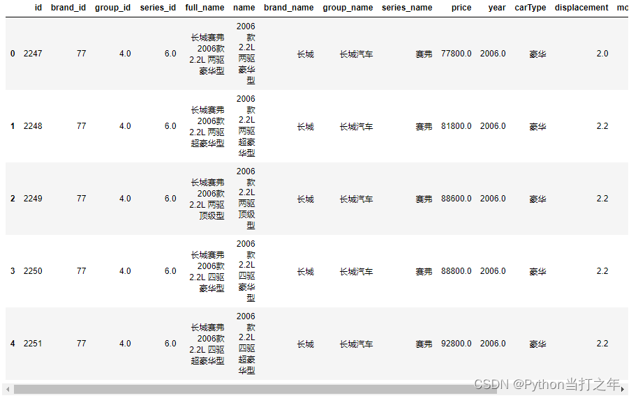
df = pd.read_csv('autohome.csv', encoding='gbk', low_memory=False)
df.head(5)
结果:
2.2 数据大小
df.shape
(40460, 18)
(40460, 18),可以看到一共有: 40460 条数据,包含18个字段。
2.3 筛选部分列数据
df1 = df.loc[:,['full_name', 'name',
       'brand_name', 'group_name', 'series_name', 'price', 'year', 'carType',
       'displacement', 'month', 'chexi', 'oil', 'chargetime', 'color']]
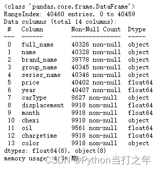
2.4 查看索引、数据类型和内存信息
df1.info()
2.5 查看所有汽车品牌
df1['brand_name'].unique()

一共有 237个汽车品牌。
3. Pyecharts可视化
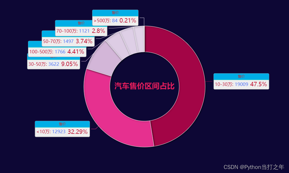
3.1 汽车售价区间占比饼图
price_bin = pd.cut(df_tmp['price'],bins=[0,10,30,50,70,100,500,7000],include_lowest=True,right=False,
                    labels=['<10万', '10-30万', '30-50万', '50-70万', '70-100万', '100-500万', '>500万'])
df_price = pd.value_counts(price_bin)
data_pair = [list(z) for z in zip(df_price.index.tolist(), df_price.values.tolist())]

p1 = (    Pie(init_opts=opts.InitOpts(theme=ThemeType.DARK,width='1000px',height='600px',bg_color='#0d0735'))
    .add(
        '售价', data_pair, radius=['40%', '70%'],
        label_opts=opts.LabelOpts(
                position="outside",
                formatter="{a|{a}}{abg|}\n{hr|}\n {b|{b}: }{c|{c}}  {d|{d}%}  ",
                background_color="#eee",
                border_color="#aaa",
                border_width=1,
                border_radius=4,
                rich={
                    "a": {"color": "#c92a2a", "lineHeight": 20, "align": "center"},
                    "abg": {
                        "backgroundColor": "#00aee6",
                        "width": "100%",
                        "align": "right",
                        "height": 22,
                        "borderRadius": [4, 4, 0, 0],
                    },
                    "hr": {
                        "borderColor": "#00d1b2",
                        "width": "100%",
                        "borderWidth": 0.5,
                        "height": 0,
                    },
                    "b": {"color": "#bc0024","fontSize": 16, "lineHeight": 33},
                    "c": {"color": "#4c6ef5","fontSize": 16, "lineHeight": 33},
                    "d": {"color": "#bc0024","fontSize": 20, "lineHeight": 33},
                },
            ),
         itemstyle_opts={
            'normal': {
                'shadowColor': 'rgba(0, 0, 0, .5)',
                'shadowBlur': 5,
                'shadowOffsetY': 2,
                'shadowOffsetX': 2,
                'borderColor': '#fff'
            }
        }
    )
    .set_global_opts(
        title_opts=opts.TitleOpts(
            title="汽车售价区间占比",
            pos_left='center',
            pos_top='center',
            title_textstyle_opts=opts.TextStyleOpts(
                color='#ea1d5d',
                font_size=26,
                font_weight='bold'
            ),

        ),
        visualmap_opts=opts.VisualMapOpts(
            is_show=False,
            min_=0,
            max_=20000,
            is_piecewise=False,
            dimension=0,
            range_color=['#e7e1ef','#d4b9da','#c994c7','#df65b0','#e7298a','#ce1256','#91003f']
        ),
        legend_opts=opts.LegendOpts(is_show=False),
    )

)
效果:
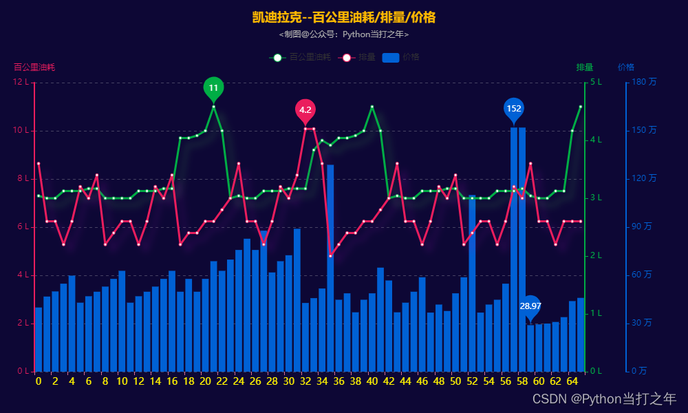
3.2 xx品牌汽车百公里油耗/排量/价格
colors = ["#ea1d5d", "#00ad45", "#0061d5"]
width = 3
car_brand_name = '凯迪拉克'
# car_brand_name = '玛莎拉蒂'
data_tmp = df1[(df1.brand_name == car_brand_name)]
data = data_tmp.copy()
data = data.dropna(subset=['price','displacement','oil'])
data = data[(data['price']>0) & (data['displacement']>0) & (data['oil']>0)]
data['price'] = data['price'] /10000
price = data.price.values.tolist()
displacement = data.displacement.values.tolist()
oil = data.oil.tolist()
region = [i for i in range(len(price))]
...
line2.overlap(bar1)
grid2 = Grid(init_opts=opts.InitOpts(width='1000px', height='600px',bg_color='#0d0735'))
grid2.add(line2, opts.GridOpts(pos_top="20%",pos_left="5%", pos_right="15%"), is_control_axis_index=True)
效果:
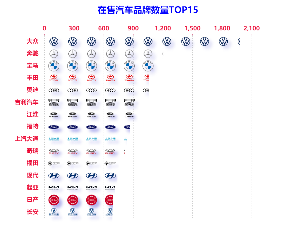
3.3 在售汽车品牌数量TOP15象形图
df_brand_name_tmp = df1.groupby(['brand_name'])['name'].count().to_frame('数量').reset_index().sort_values(by=['数量'],ascending=False)
df_brand_name = df_brand_name_tmp[:15]
x_data = df_brand_name['brand_name'].values.tolist()[::-1]
y_data = df_brand_name['数量'].values.tolist()[::-1]
for idx,sch in enumerate(x_data):
    icons.append(dict(name=sch, value=y_data[idx], symbol=sch_icons[sch]))
p1 = (
        PictorialBar(init_opts=opts.InitOpts(theme='light', width='1000px', height='700px'))
        .add_xaxis(x_data)
        .add_yaxis('',
            icons,
            label_opts=opts.LabelOpts(is_show=False),
            category_gap='40%',
            symbol_repeat='fixed',
            symbol_margin='30%!',
            symbol_size=40,
            is_symbol_clip=True,
            itemstyle_opts={"normal": {
                'shadowBlur': 10,
                'shadowColor': 'rgba(0, 0, 200, 0.3)',
                'shadowOffsetX': 10,
                'shadowOffsetY': 10,}
            }
          )
        .set_global_opts(
            title_opts=opts.TitleOpts(title='在售汽车品牌数量TOP15',pos_top='2%',pos_left = 'center',
                                   title_textstyle_opts=opts.TextStyleOpts(color="blue",font_size=30)),
            xaxis_opts=opts.AxisOpts(
                position='top',
                is_show=True,
                axistick_opts=opts.AxisTickOpts(is_show=True),
                axislabel_opts=opts.LabelOpts(font_size=20,color='#ed1941',font_weight=700,margin=12),
                splitline_opts=opts.SplitLineOpts(is_show=True,
                                                  linestyle_opts=opts.LineStyleOpts(type_='dashed')),
                axisline_opts=opts.AxisLineOpts(is_show=False,
                                        linestyle_opts=opts.LineStyleOpts(width=2, color='#DB7093'))
            ),
            yaxis_opts=opts.AxisOpts(
                is_show=True,
                is_scale=True,
                axistick_opts=opts.AxisTickOpts(is_show=False),
                axislabel_opts=opts.LabelOpts(font_size=20,color='#ed1941',font_weight=700,margin=20),
                axisline_opts=opts.AxisLineOpts(is_show=False,
                                        linestyle_opts=opts.LineStyleOpts(width=2, color='#DB7093'))
            ),
        )
       .reversal_axis()
    )
效果:
3.4 在售汽车品牌数量TOP15堆叠图
效果:
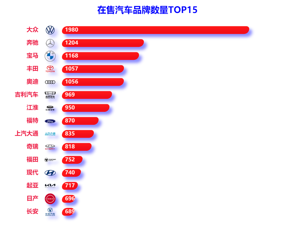
- 可以看到 大众汽车 在售量遥遥领先, 奔驰、宝马 等品牌紧随其后
3.5 汽车品牌词云
brand_name_list = []
for idx, value in enumerate(df_brand_name_tmp.brand_name.values.tolist()):
    brand_name_list += [value] * (df_brand_name_tmp.数量.values.tolist())[idx]
pic_name = '词云.png'
stylecloud.gen_stylecloud(
    text=' '.join(brand_name_list),
    font_path=r'STXINWEI.TTF',
    palette='cartocolors.qualitative.Bold_5',
    max_font_size=100,
    icon_name='fas fa-car-side',
    background_color='#0d0735',
    output_name=pic_name,
    )
Image.open(pic_name)

4. 项目在线运行地址
以上就是本期为大家整理的全部内容了,赶快练习起来吧,原创不易,喜欢的朋友可以点赞、收藏也可以分享(注明出处)让更多人知道。


 1316
1316


 被折叠的 条评论
为什么被折叠?
被折叠的 条评论
为什么被折叠?
 到【灌水乐园】发言


